Driving forward Stylish Health Care
Brand and Product Design // Design Concept
Design Brief
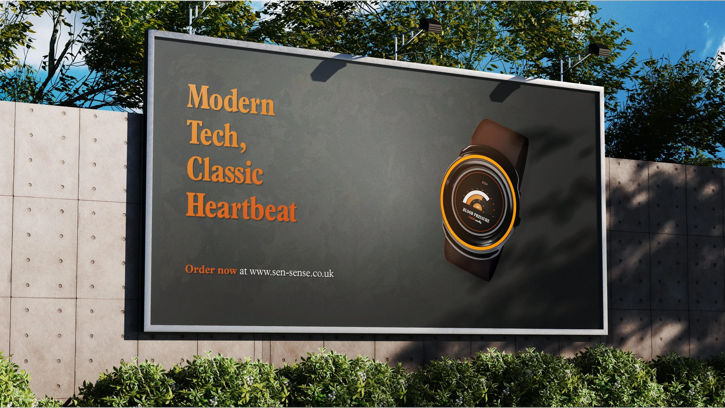
SEN started as a typographic brief provided by Monotype. It challenged designers to create a Health Tech brand that uses typography as its key visual identity. The brand appeals to an older audience who may be wary about modern smart watches and are interested in contemporary designs specifically classic cars of the 50’s and 60’s.
Design Strategy
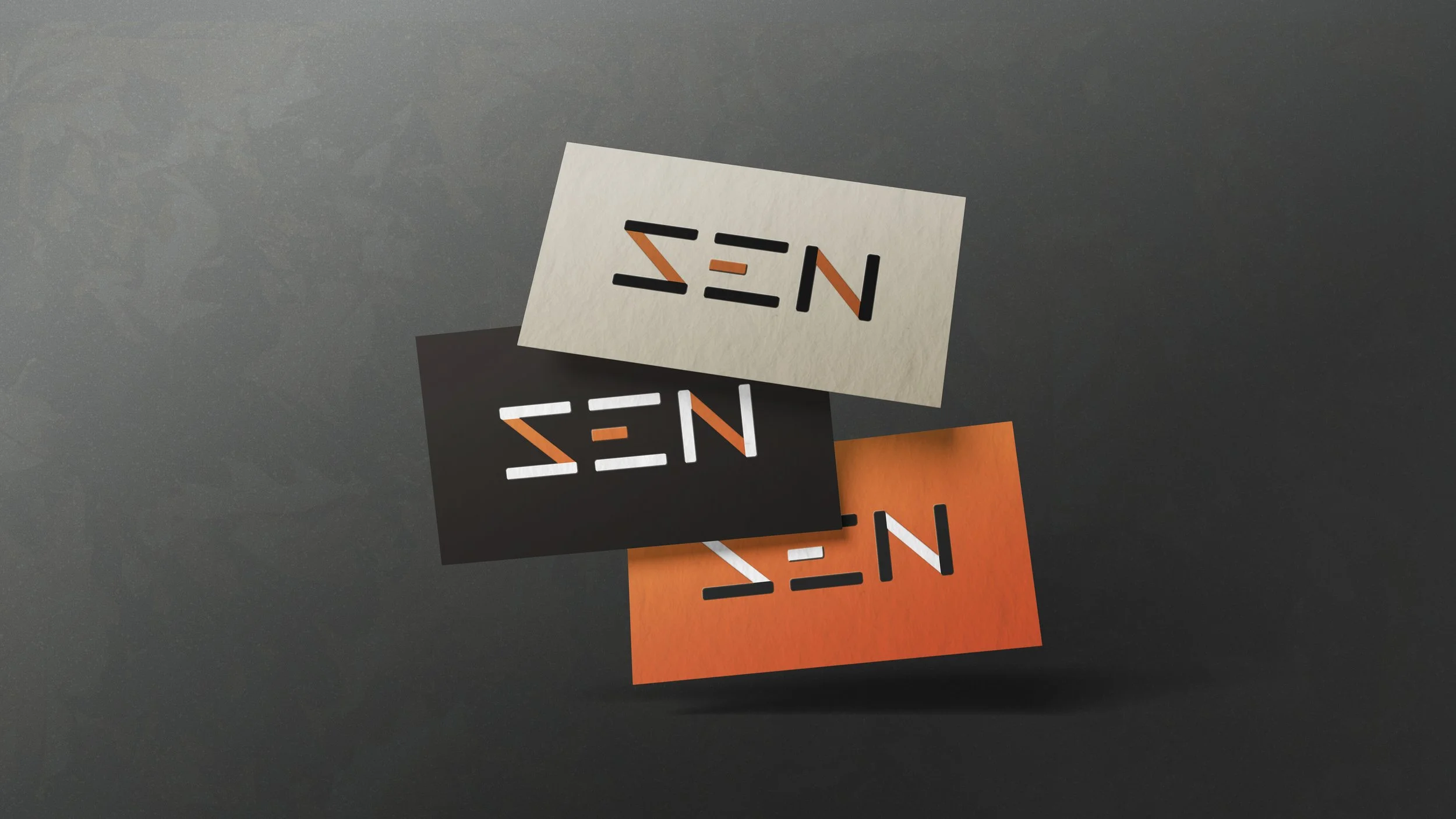
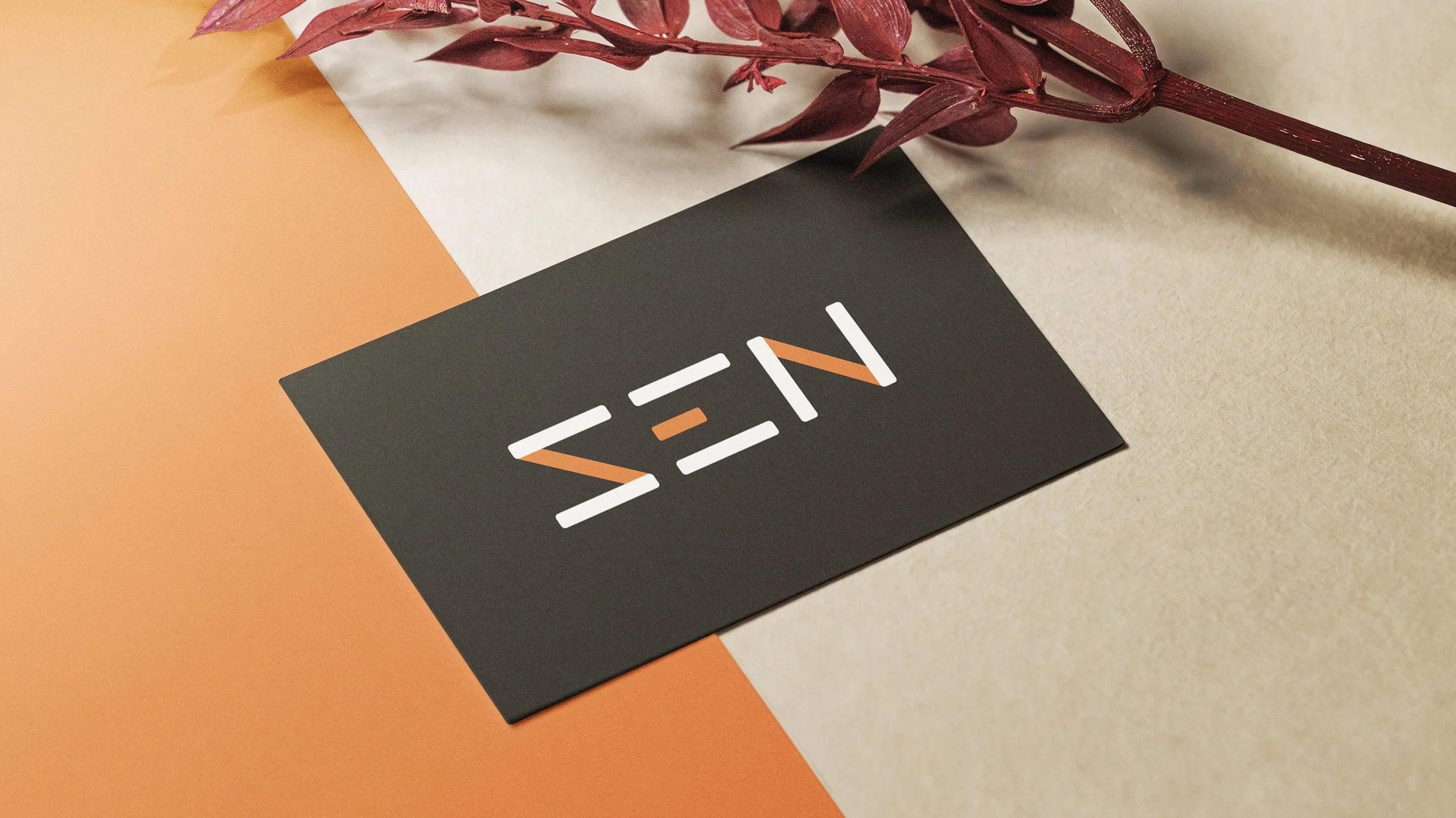
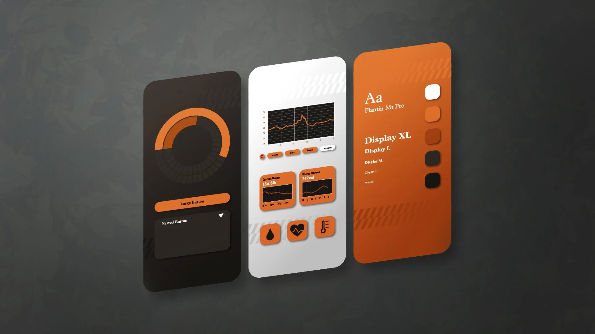
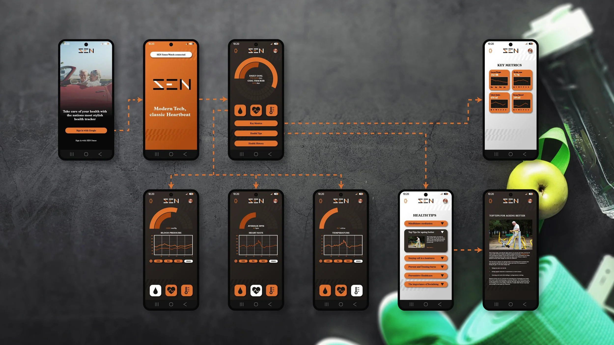
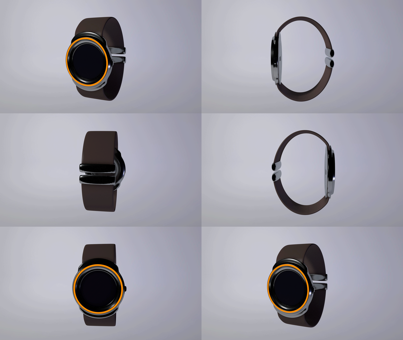
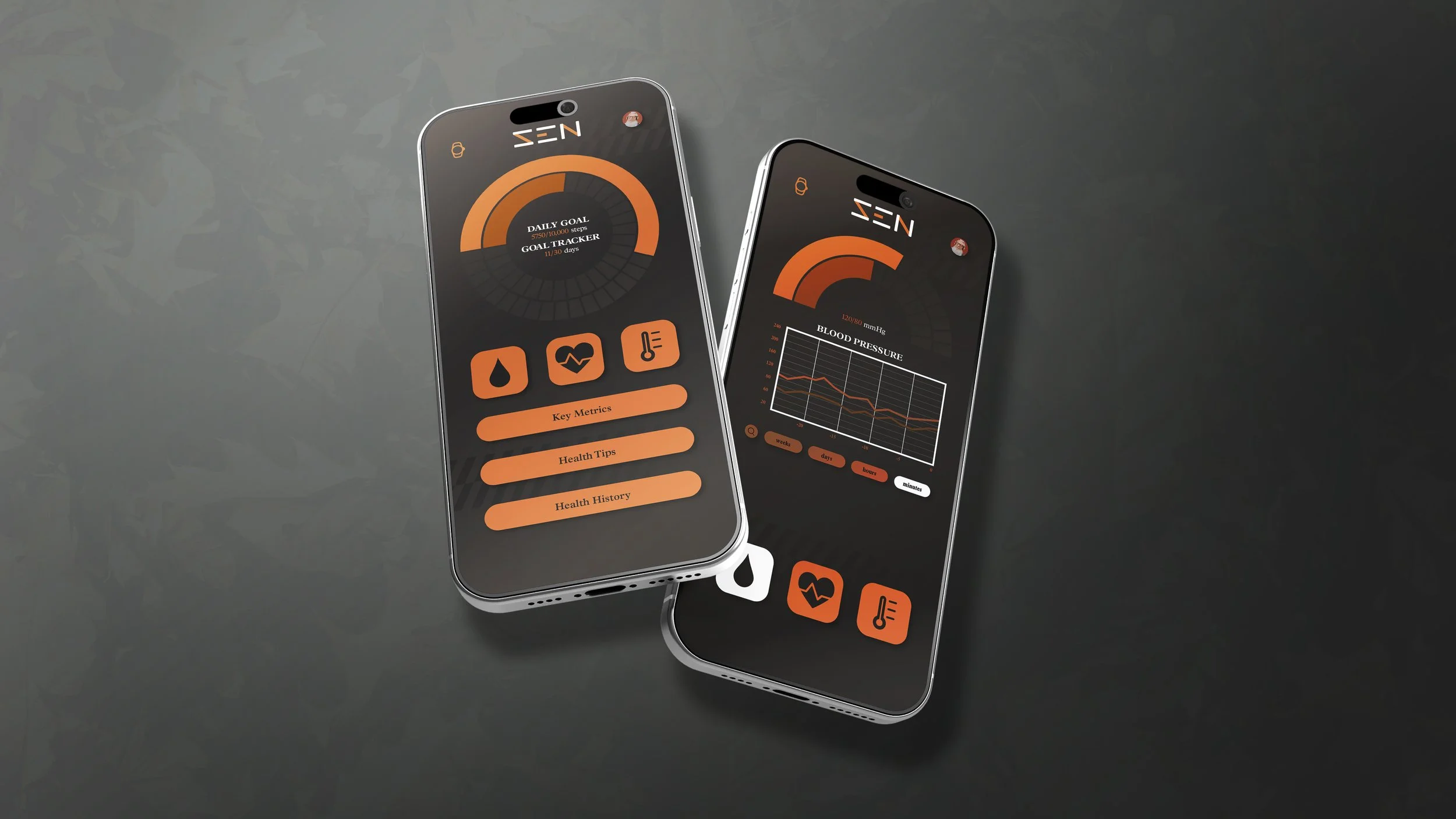
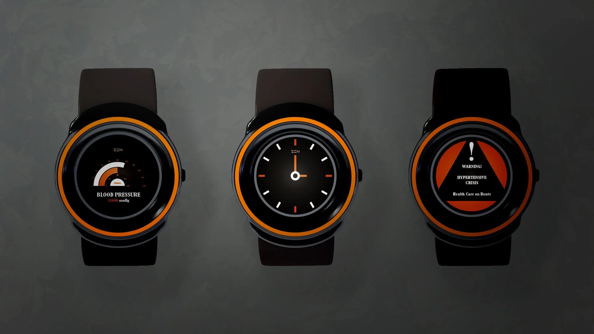
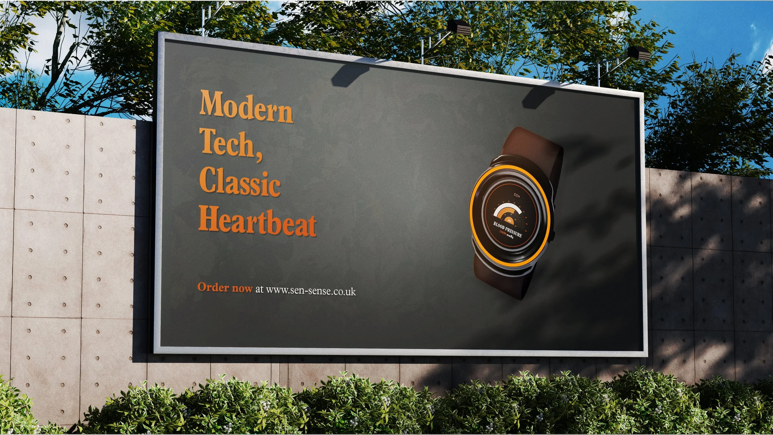
Taking inspiration from the look and feel of classic cars, the brand uses clean lines and burnt oranges to feel retro while remaining modern. The app is simple to navigate and use without overwhelming features that would scare less technologically minded users but with the depth of modern devices. The SEN Sense smart watch uses leather and metal to reflect luxury watches, with the device screens mimicking speedometers.
Outcome
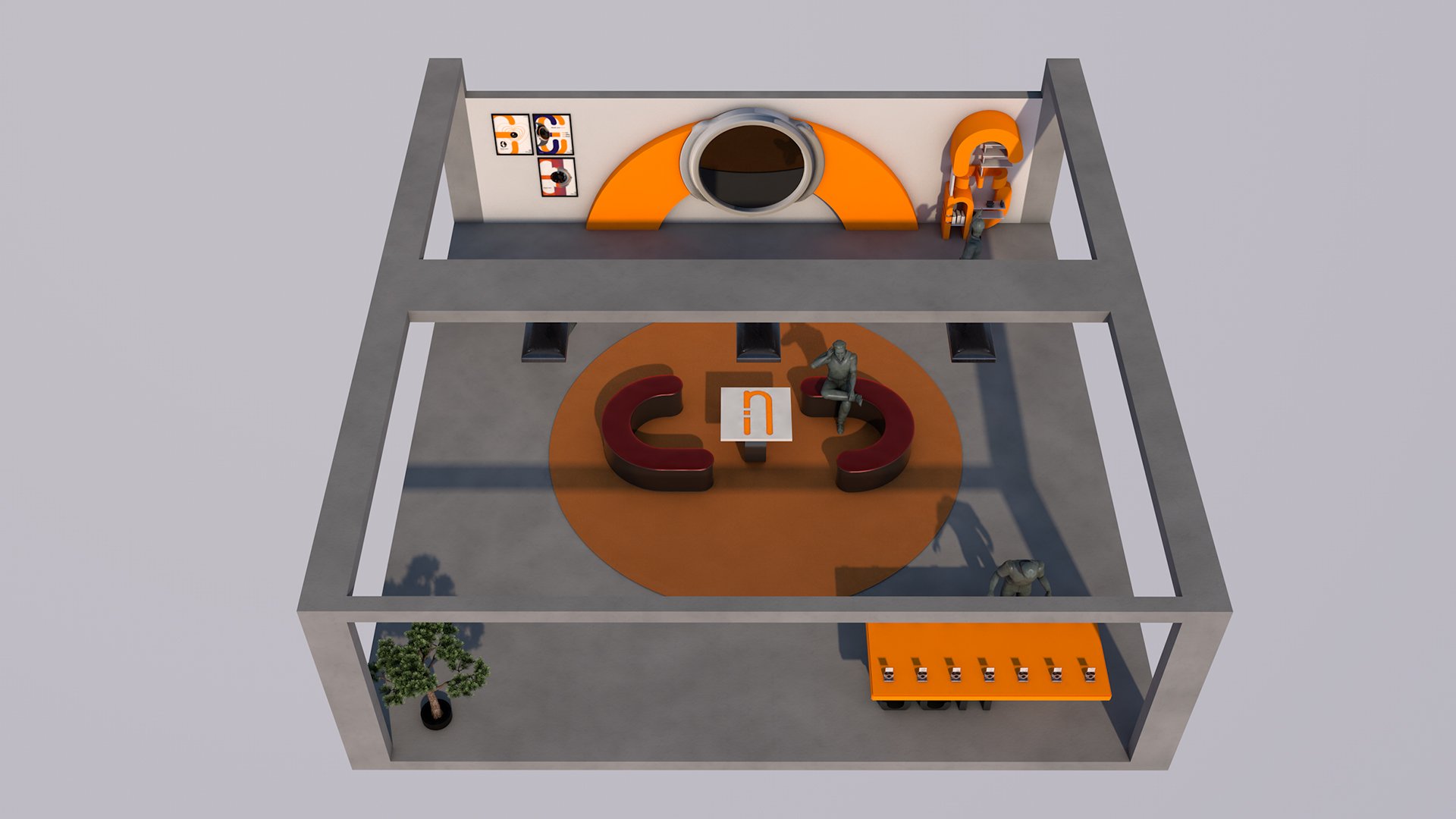
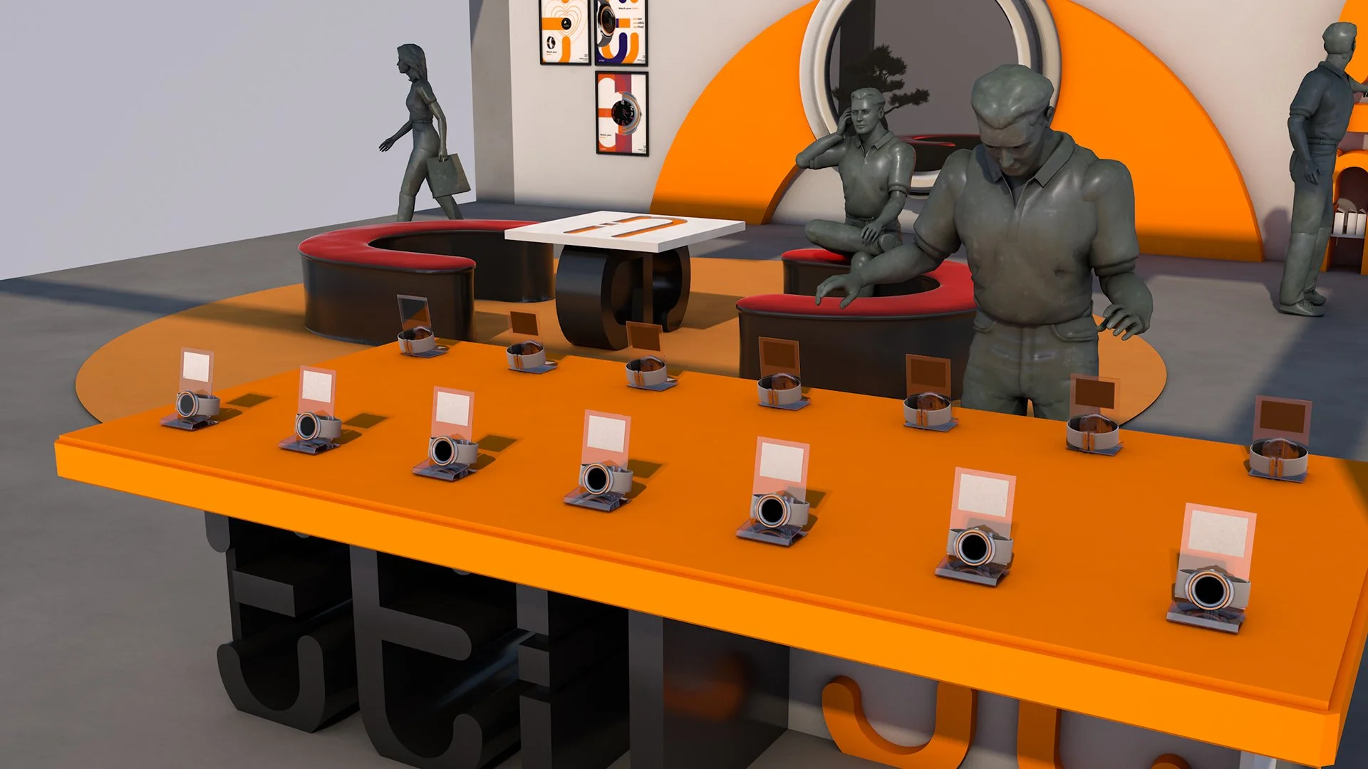
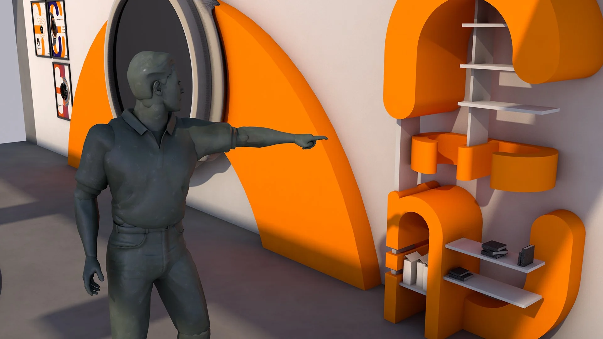
The final outcomes present the retro and luxury style I was going for, hitting notes of 70’s retro design unintentionally. The biggest retractor from the outcome is the expo space, designed as a showcase for the watch. With a redesign to lean into the design aesthetics already explored within the rest of the brief, it would create greater outreach and a stronger presentation.



Credits
Maxon., Cinema4D. R23. (Bad Homburg, Germany: Maxon.,1990)
https://www.maxon.net/en/cinema-4d