Twelve Beers Twelve Months
Case Study for Black Storm Brewery
Black Storm Brewery is an independent craft brewery based within the North East of England. Driven by explosive growth they have developed a collaboration project called ’12 Beers in 12 Months’, where they showcase 12 various experimental beers over the course of a year: including gluten free and vegan beers. After successfully running the project, they want the next cycle to treat ‘12 Beers in 12 Months’ as its own brand. They are looking to target a younger audience with a modern/urban design. Their ideal customer is 18-35, passionate about Craft Ale and socially interactive. They want to explore similar styles to Graffiti, Tattoos, and Comic Books. The outcomes would involve designing or refining;
The current ‘12 Beers in 12 Months’ logo.
Selection of stationery matching the Branding and Can design.
Craft Ale Can design.
Commemorative 12 can box.
For this independent brief I worked individually as a Brand Designer. Since this project is a case study I will be highlighting the logo design process and sketch experimentation.
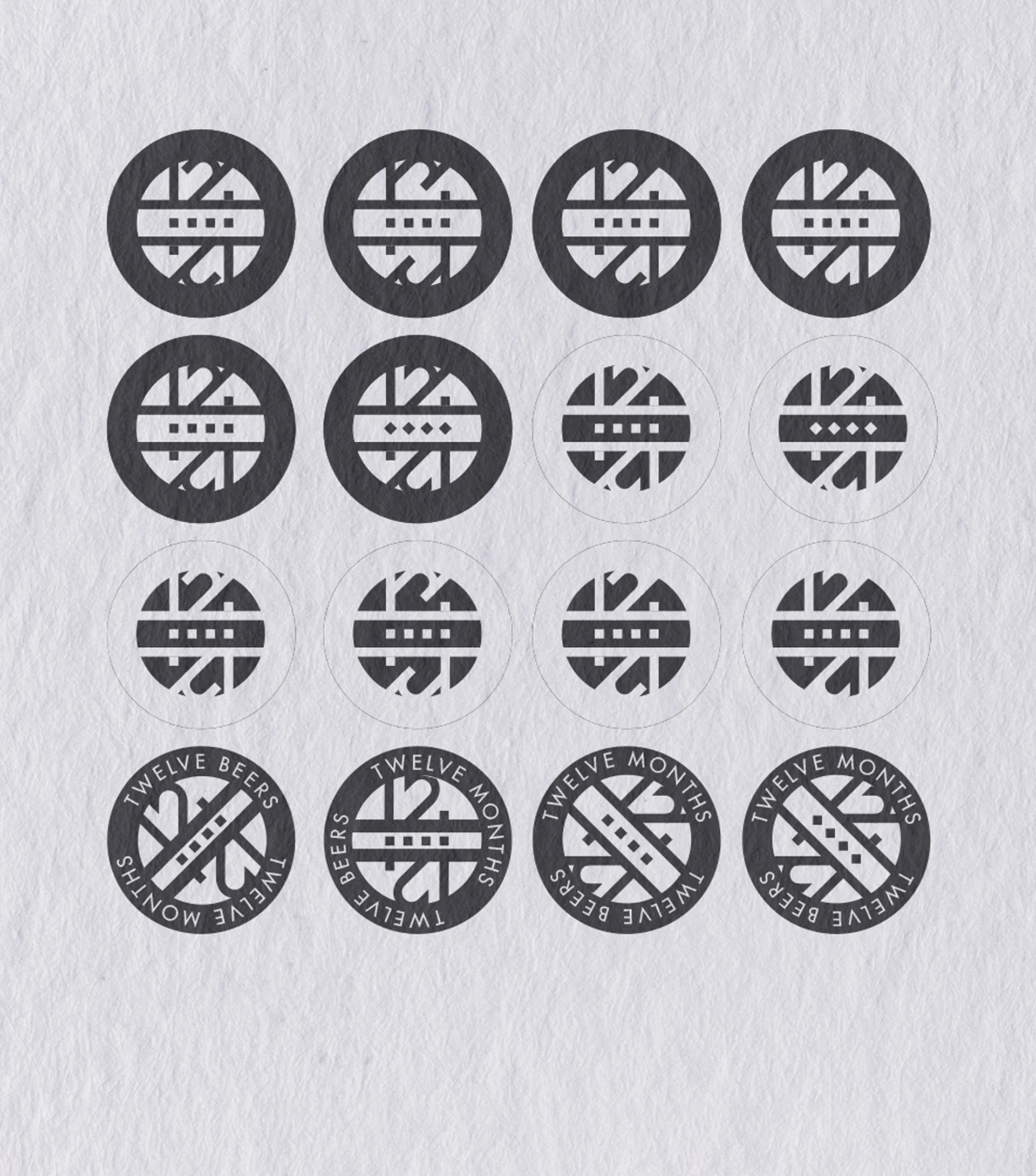
Taking the current logo, I began experimenting with shape and proportion. Keeping in mind the visual styles the client wanted exploring. I realised that ’12 4 12’ was a more concise form of ’12 Beers in 12 Months’. Experimenting first with numbers, then adding ‘twelve’ to create an element of visually asymmetry which matched the urban aesthetic. I choose a couple designs that I wanted to explore digitally, this helped me check if the design would remain readable at different size levels. A few of them worked but ultimately I went with a combination of two digital sketches.

Logo Design
The concept of the final logo is relatively simple. Using reflection and shape to have the viewer read ‘12 4 12’ without the typography. The logo was built using 40px x 40px as a base guideline. This creates visual structure between all the elements so each shape either diagonal or straight lines up and remains reflective. I experimented with this element in various forms but I liked how making the 4 squares into diamonds helped break the structure of everything being visually level. I did the same with the type selection, paying close attention to text weight and readability at a smaller size.
Brodusa
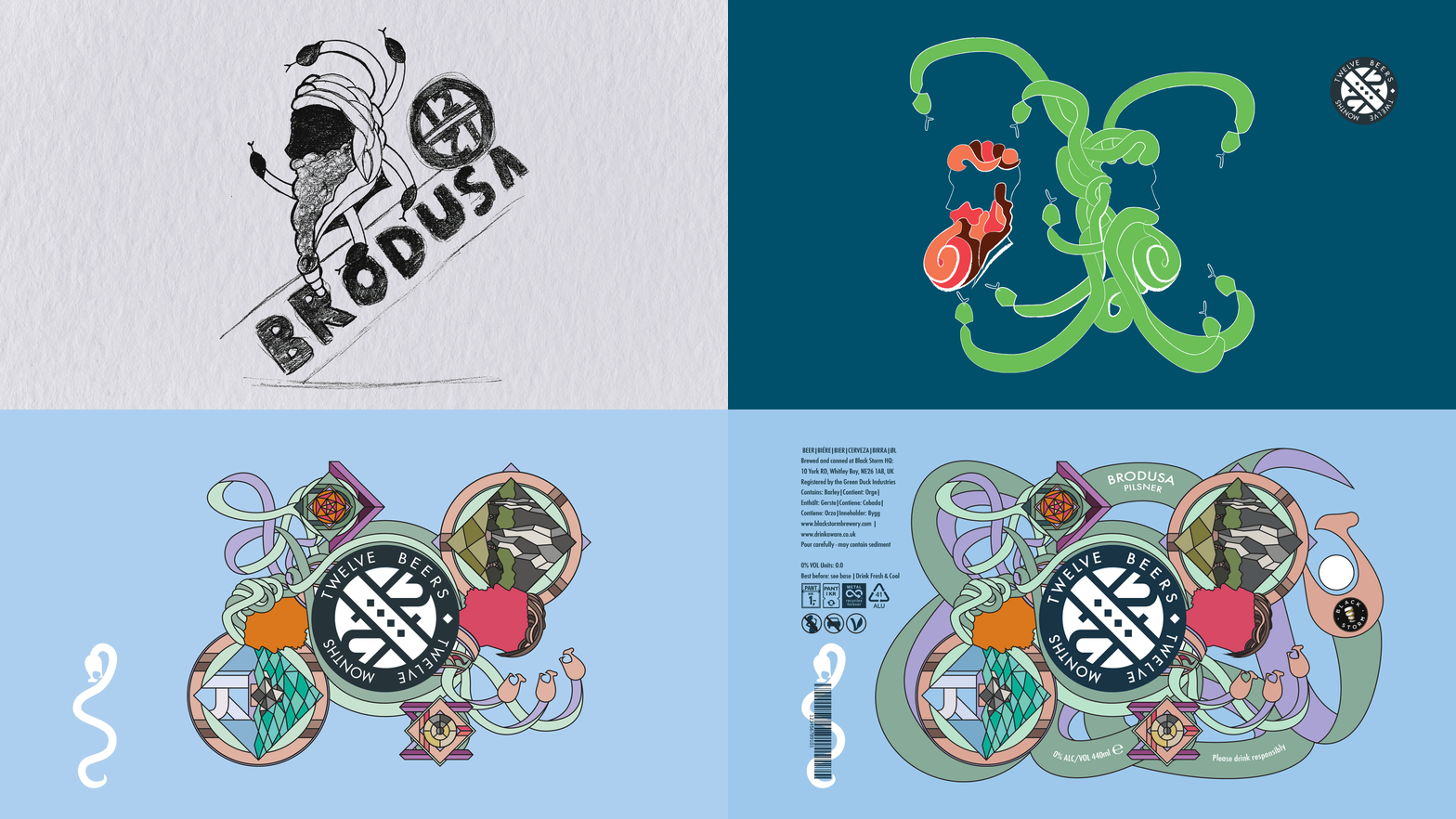
With the logo defined and setting the visual basis of the Branding I started work on the can design. Focusing on this conversation aspect and the logos basis of reflection I was inspired by the Greek myth of Medusa. Instead of being petrified when looking into Medusa’s eyes however, I wanted the can to enlighten the audience becoming a means for reflection. Initially I started off with more basic Greek inspired visuals but I did not like the direction the design was developing. I wanted a visual style that was bold and urban, and would create a conversation for the brands social audience.
I started researching similar urban designs, focusing on bold colours and use of block colour. This led me to the late Milton Glaser, who was an American Graphic Designer. It was his 1966 poster for Bob Dylan: which can be found to the left, that become the basis for my can design. As a quick visual check I mixed my Brand logo and his 1980 Saratoga Festival Poster. I really liked the contrast between the bold black and white logo and the surrounding pastel elements.


Final Design
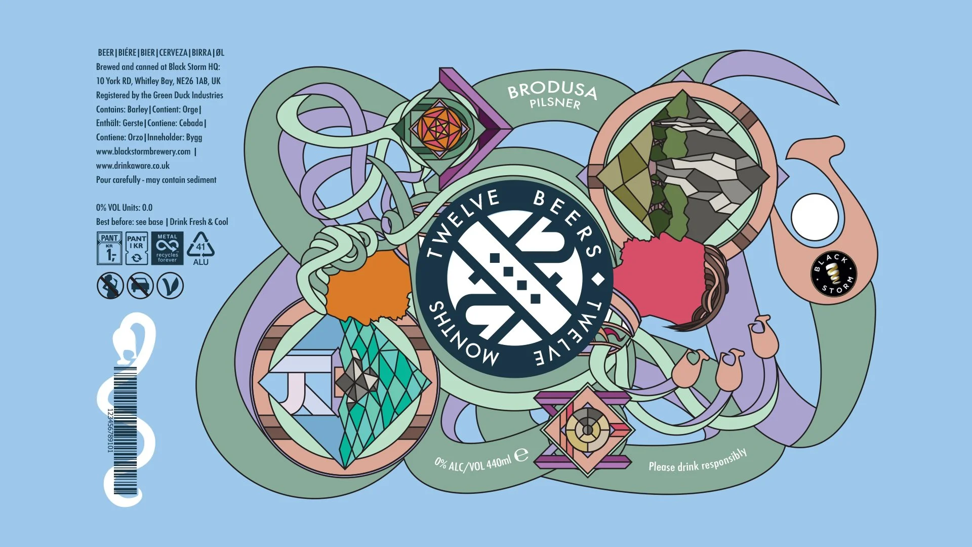
The final can design used the structure of a playing card to create
asymmetric reflection. With various snakes coiling and connecting different elements to provide visual interest but also show how each element flows
from one to the other. Within the design are glass like portals showcasing different environmental disasters with letterforms hidden within the rest of
the design. These both create a discussion with the audience and provide an avenue for reflection. These themes are carried over to the stationery but with
a darker background.
Credits
Glaser, M. (1980) ‘Saratoga Festival’. Available at: https://www.miltonglaser.com/store/c:posters/939/saratoga-festival-1980 (Accessed: 22/05/25)
Glaser, M. (2008) ‘Dylan Reproduction’. Available at: https://www.miltonglaser.com/store/c:posters/824/dylan-reproduction-2008/ (Accessed: 22/05/25)


