Pukka: Artic Tea
Design Concept for Pukka Herbs
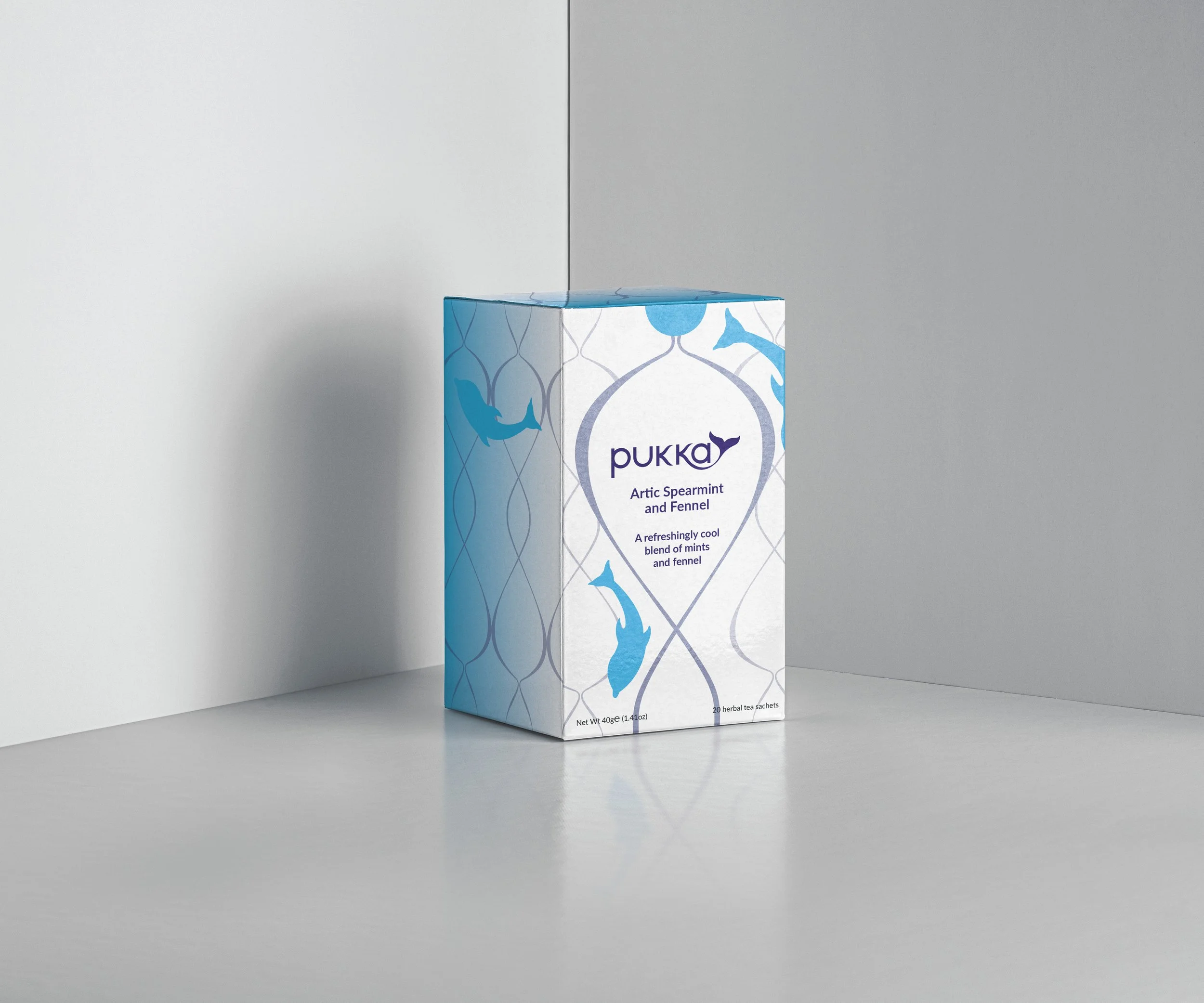
Pukka herbs are a herbal tea company based within the UK. They focus on herbal infusions and sustainable approaches in providing delicious and healthy tea. This design concept is for a campaign for the Pukka Herbs that would aim to raise awareness for the ongoing challenges that threaten our planets oceans and seas. The outcomes I designed were a reimagined logotype that highlights the nautical themes whilst remaining recognisable and a limited edition range of new tea types based upon the Artic Sea.
I produced a range of designs transforming the logotype, but realised that I would need to design a Typeface unique to both Pukka Herbs and this campaign. My first design Squakka was boxier and used square edges, however I wanted the typography to play off the more circular motif of plastic rings. My final design Pukka used larger spans and exaggerated curves to allude to this.